Introduction
The members of the hub have a long history of creating spaces that give access to knowledge beyond mainstream narratives and stereotypes. Over time, we came to recognise that the orthodox views of human functioning are, in many cases, exploitative and misaligned with contemporary understandings of growth and self-improvement. This realisation led to a joint effort to establish a platform that speaks and appears differently—an intentional departure from what expected to be a norm in this space.
Our visuals are not accidental. Visual language is among the most powerful forms of meta-languages, making up an estimated 70–80% of all human interaction. All humans extract the most essential information from the environment visually—initially through a quick and dirty instinctual assessments, followed by more refined, reflective interpretations. It’s no surprise, then, that we’ve invested deeply in the visual message of our platform to speak to the soul through the eyes.
The website
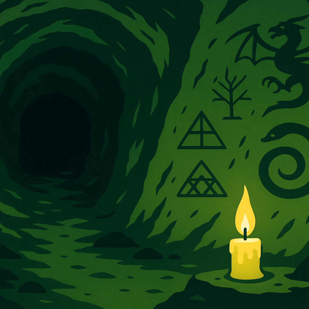
The overall aesthetic—the choice of colours, the proportion and use of layout elements—aims to evokes the atmosphere of a quiet withdrawal for preparation. Our signature dark greenish hue, the primary brand colour, a symbol of a moss-covered cave for a pre-combat stage: a space for introspection. Here, one gathers and refine mental and emotional resources, even seeking guidance from external platforms such as ours. This is a space of quiet transformation, which is precisely why we chose not to depict scenes of combat with blood and sweat-covered fighters in the arena. Those visuals would represent the next stage—the fight itself.

Our greenish tone has a secondary meaning to it. Because it sits between the greens of nature and the blues of sky and water, rendering it ambiguous and unclassifiable—much like the unconscious itself. Regular readers will be familiar with our frequent references to Jungian psychology, in which the unconscious is treated as a repository of rich, but obscure material. Modern psychology, for all its empirical advances, in cutting off what is not statistically capturable creating a blind spot for itself that leads to loosing connection with centuries of philosophical and intuitive knowledge—wisdom that Jung so adeptly sought to reintegrate. The mossy, shadowy green we have chosen is to represent the unconscious in all its unclassifiable and unquantifiable nature.
Within this cave, guidance comes in the form of a flickering candle—the yellow accents displayed throughout our platform. This yellow symbolises conscious awareness: the small but vital flame of understanding that helps reading the markings on the cave walls. These metaphorical carvings, the information itself, are reflected in our micro-content blocks with small bits of insight, and line-style illustrations with their simplicity. Complementing this is a softer, gentler green used for action colour throughout the site. It represents clear water and nourishment—trusted resources that the reader can safely consume.
The dragons artworks
Our central artwork—the dragon—is equally layered with symbolic meaning. Chosen for its archetypal significance, the dragon represents the shadow in its most primal and undefined form. Unlike lions or wolves, whose behaviours we understand, dragons are mostly mythical. Their existence is speculative, their features unknown. In Jungian terms, the dragon represents the initial, row stage of the shadow: the origin point where the self-work begins.
The distinct illustration style of our dragons is a combination of Eastern linocut aesthetics, representing intuitive knowledge, with the dragon body of Western tradition, representing research based information. This blend symbolises our approach: utilising both intuition and empirical research. Due to their natural limits, neither of them alone would be enough to describe such complex and unquantifiable topic as human nature. The blended artwork style used is a visual translation of how science and intuition can and need to work together to reach completeness.
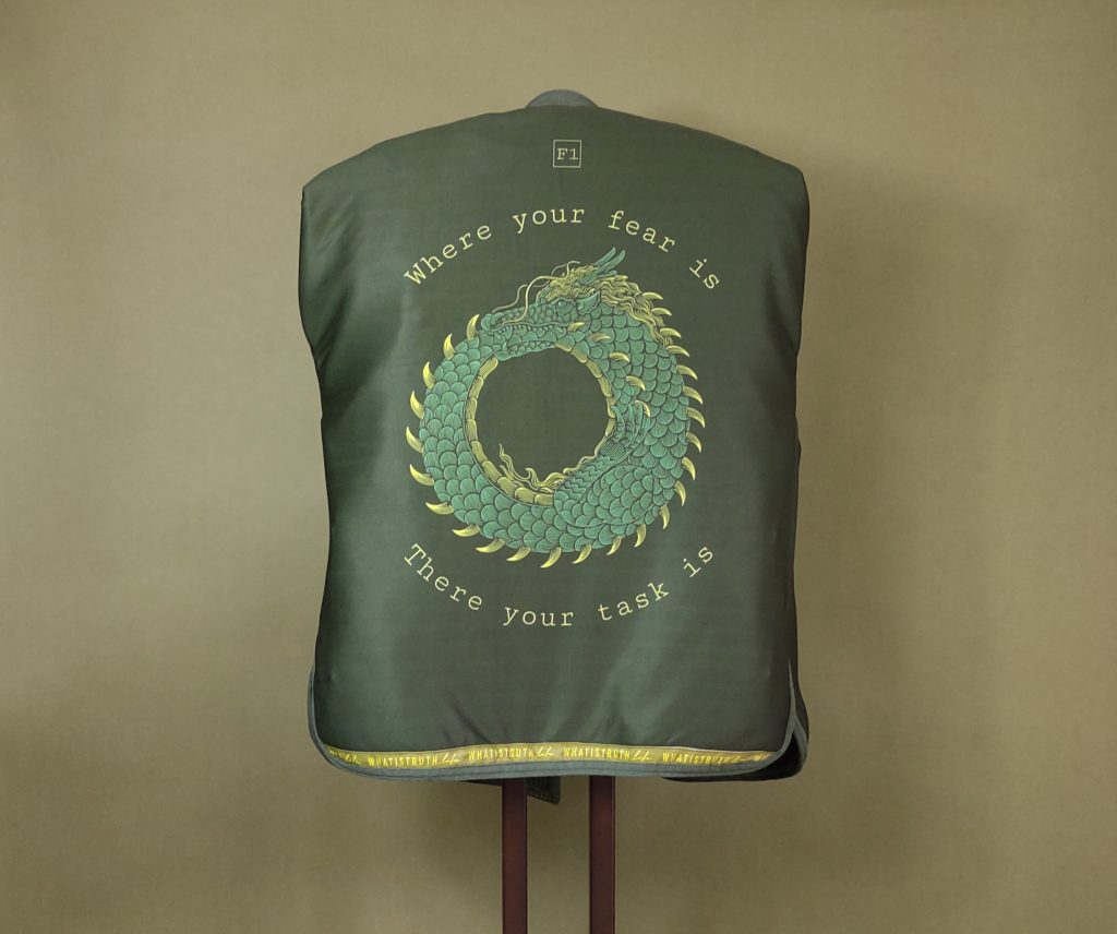
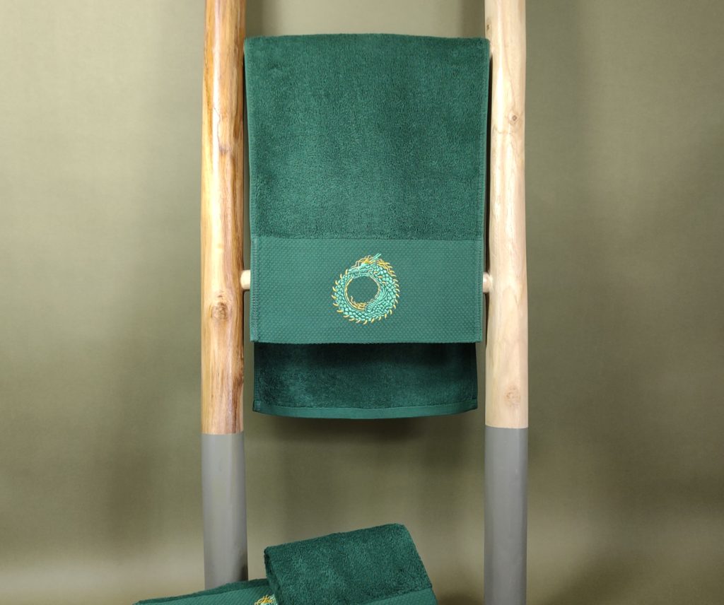
We have two artwork series because there are two key dimensions of training: the internal and the external. Internal work involves uncovering our mental and physical design and developing the body-mind connection. External work, by contrast, is about establishing boundaries and asserting and defending our mental and physical territories. In our regular training sessions, the focus remains inward—on growth and reflection. In contrast, competitions demand a shift in focus, where one’s boundaries are tested against an opponent. Accordingly, we offer two distinct gear lines. The Growth Series supports internal development and regular training, while the Competition Series is designed for the external work in tournament settings.
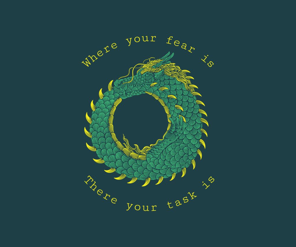
Dragon of the growth series – the green Ouroboros
The Ouroboros dragon—depicted as a dragon biting its own tail—symbolises the cyclic renewal of the self. This dragon represents the inner journey of taming one’s shadow, an active and infamous part of the unconscious, usually incorporates anxiety, fear, guilt, shame etc., in order to access its power. We don’t know the extent of this hidden power until we start to work with it. Martial arts training inherently pushes our physical and mental limits and exposes us to different life values and morals, stirring the unconscious and shedding light of the unworked, unintegrated part of it: our dragon. This process is cyclic, moving from stages to stages, where self-work is followed by resting periods before another round starts to step higher one more time. It reflects our core philosophy of continuous growth and improvement in the pursuit of excellence.
With this work, just like an alchemist, we forge something of a higher value from raw materials. The outcome of this transformational process, which often used to describe the individualisation process, is referred to as our Magnum Opus, the ultimate masterpiece, the enlighten and complete self with all its part integrated and respected.
The green hue of the Ouroboros signifies the unrefined nature of the starting point—immaturity, and potential. The dragon’s spikes represent necessary defences, though they are rudimentary and far less efficient than a proper shield. These spikes are coloured with yellow, referencing consciousness and the process of rationalisation—a great guide but an inefficient tool of protection. In a few places, we depict the dragon accompanied by a quote from C.G. Jung:
‘Where your fear is, there your task is’.
This serves as a reminder that the shadow is not silent; to find the areas to improve, follow the emotional charge. There is wisdom in resistance.
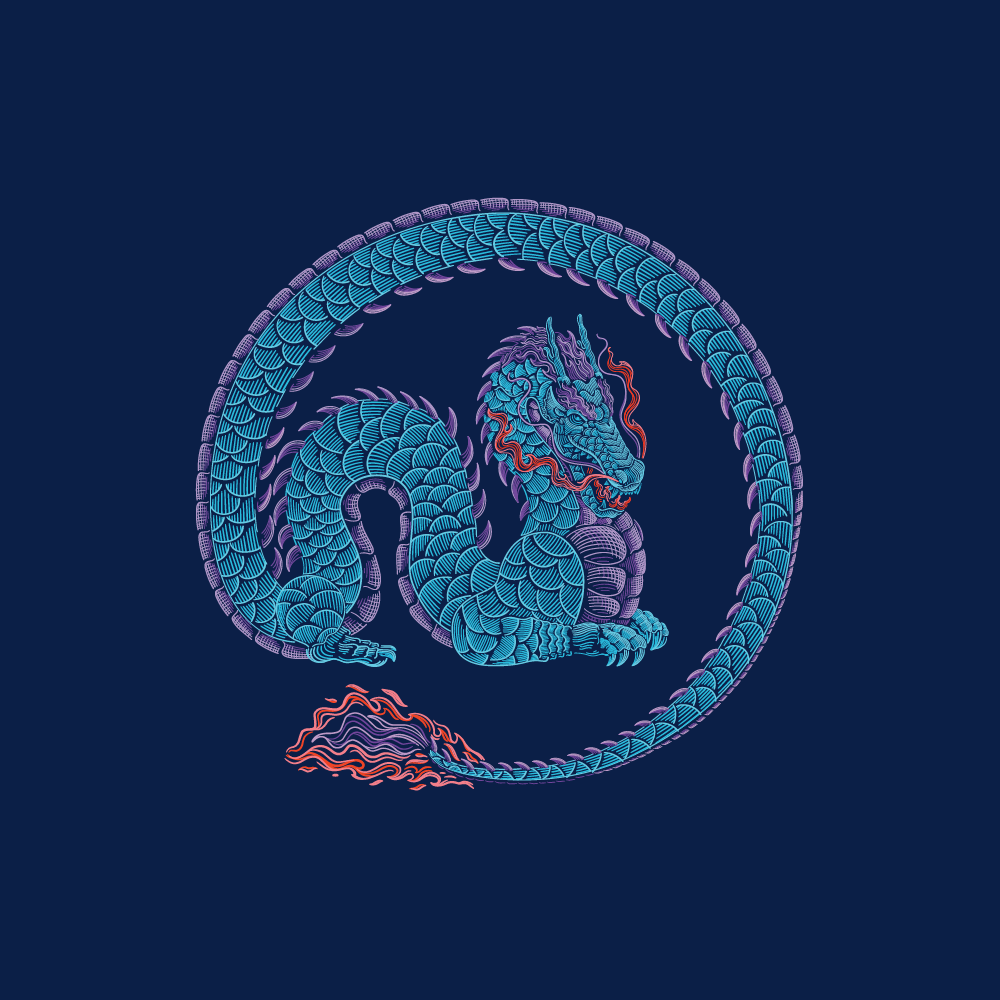
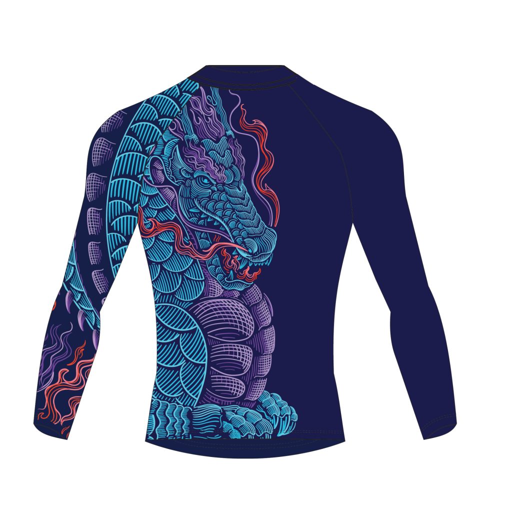
Dragon of the competition series – the blue dragon
The blue dragon represents the shadow that has been integrated, and transformed into power. By the time of stepping into the arena, ideally much of the once locked energy has been redirected throughout regular training and cyclic self-work. What was once anxiety and fear, now becomes understanding of maltreatment and defence responses; a wisdom behind the scars. When the shadow is fully seen, it ceases to be shadow. It becomes history—scarred but meaningful—and serves to protect the self. This protective quality is symbolised in the dragon’s coiled tail, which ringfencing the body to shield against external forces.
The colour blue was chosen to represent this settled, cooled state that has been reached via training and integration work. The dragon’s internal fire, rendered in red, represents unleashed drive and vitality—an inner force now freely coming out. Like most inner powers, it remains largely invisible to others, except for subtle signs—like the wiggling tail of the dragon—that hint at depth and resilience.
Closing Thoughts
Much of what we aim to convey in our platform cannot be easily captured in words. That’s why we’ve chosen visual language as one of our primary mode of expression—using colour, form, and symbolism to communicate the underlying philosophy of the platform. Every visual element, from the mossy green cave to the dragons and flickers of yellow light, is designed to speak directly to the intuitive mind. These choices allow us to share complex ideas—about growth, the unconscious, and transformation—more powerfully and precisely than language alone could.